
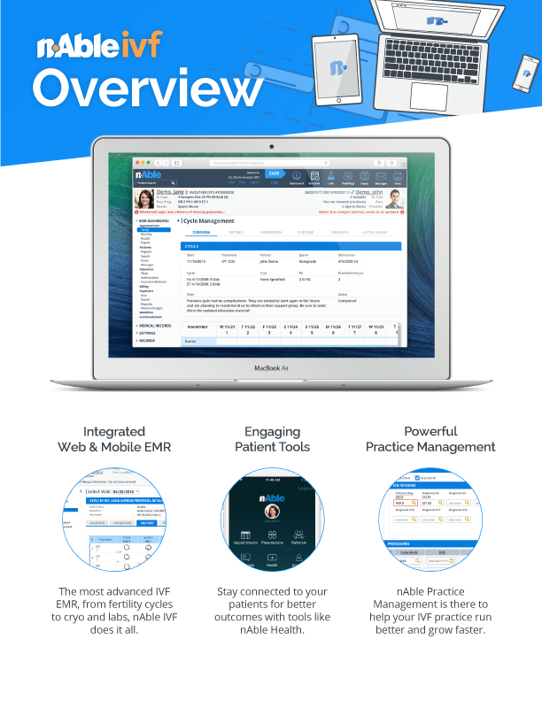
nAble IVF
nAble IVF is the latest product for fertility clinic physicians, patients, and staff from nAbleMD. I worked with the team to design the UX and UI for the web and mobile apps and develop potential marketing and branding.
UX/UI • Product Design • Iconography • Branding
Web app
The web version of nAble IVF is the primary product and is used daily by every role in the clinic. There are four primary components: the appointment scheduler, the patient charts, the fertility cycles, and the billing and one of the unique points of our service is the integration of all of these into one central product.


nAble IVF was built on the nAble Web EHR UX/UI redesign. On this project I emphasized proper sketching, wireframing, mockups and extended iteration with user testing, including creating user profiles and large screen flows.

The main dashboard of nAbleIVF is designed to toggle between "EMR" and "Practice Management" mode to emphasize medical or managerial tasks. It also emphasizes tasks specific to the user logged in:
- Front desk staff see patients that need to be recalled, appointments that were missed
- Nurses see labs that need to be ordered and patient messages to reply to
- Physicians see results to review and appointments for the day
- Practice Managers can review the clinic revenue, reports, and success measures


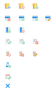
By tracking front desk staff app events and interactions, we saw over 30% of actions dedicated to managing, signing-in, and processing patients. We developed unique views to display different emphasized information and interactions such as the multi-scheduling view, daily view, EMR view, and grid view. I also developed custom iconography built on a base topic and an overlay status graphic to let the front desk know of patient statuses, missed payments, missing information, and current step in clinic workflow.


Patient demographics had to be quite detailed, because government regulations require extensive information about each patient for large scale studies. The yellow highlighted sections are important for meeting government standards for end of year treatment quality measures and their rewards. Every little bit helps!


This information-filled screen represents the central aspect of nAble IVF, the fertility treatment cycle. We went for high visibility with customizable colors for drugs, easy contextual menus which popup nex tto selected elements, and sticky headers and left column to always give labels. It's a pretty experimental and novel approach to fertility cycles that emphasizes interactivity and readability. We've had some fantastic feedback and user responses so far.
mobile app
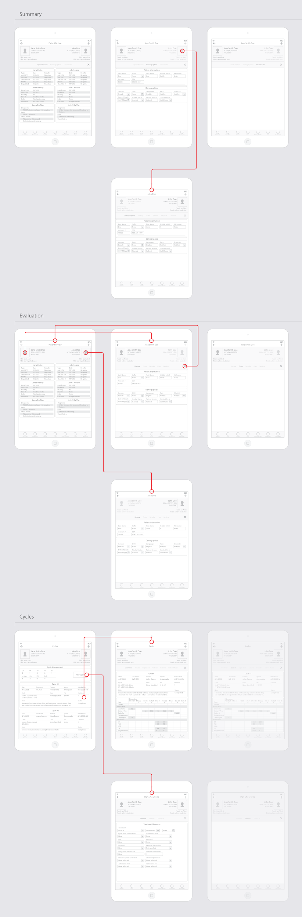
The biggest task was designing the new IVF iPad EHR from scratch. I had worked previously to try to improve the user experience and layout of the old iPad EHR, but the code was dated and poorly optimized and the changes I could make were limited. I now had the chance to apply the lessons I learned from user interviews and usability testing.


I started by charting on paper the least number of screens and actions for the minimum viable product. It needed to function primarily within an exam room with a patient in front and provide an easy way to view large amounts of data and document an encounter. I broke the chart down into seven main components: review (history), patient evaluation, fertility cycles, patient labs, cryo (frozen samples), embryology, and contact (patient messaging).


These are reflected in the sticky primary navigation bottom icons, and for each of these options secondary navigation opens at the top under the patient bar, designed with the flexibility for anywhere from one to seven options. Finally, tertiary options are available by selecting the male or female partner, or the patient bar drop down to view more information at any time.
With a similar audience to nAble Web, we focused on the visual design on two main principles:
- Performance outweighs any visual effects, but we want it to be recognizable as IVF specific. That means no heavy animations, no large images, no slow scripts, but clear and sharp iconography. This is enterprise software and despite how much I love making beautiful designs, performance is king.
- Logical interactions to provide intuitive experiences. Everything icon and every clickable object needs to be distinct and its form needs to help dictate its function.


New Schedule Iconography
Fertility Cycle Iconography
Branding & Marketing
I did some preliminary branding work to begin to establish a unique identity for nAble IVF. We wanted a strong message that was a little more fresh and bold than our nAble Web logo. Blue is for strong and safe, and orange is for the hint of bold creativity that punctuates our products.


I also began experimenting with some initial web design and illustration work for the future nAble IVF website. Going for a fresh look, I began to pitch comparable SAAS modern site designs to the team to figure out a creative angle.
In this example, I was experimenting with a DropBox style design for a product tour, with a similar layout and style of illustrations. I believe to start on the road to a unique style, first you try other styles. With enough iteration, inspiration will hit.
I began work on some print designs trying to incorporate the depth of detail and color the marketing team wanted to try for brochures. Although a bit bright for the web, they catch attention at tradeshows. These are some initial concepts with bright and unique individual page colors, strong bold imagery, and copywriting to meet the content requirements.


Results
nAble IVF is still in pre-alpha, so some products details and visuals are still in development. We've begun initial testing with a large 12 location IVF clinic and we hope to have it ready for release in a couple of months!